The Hidden Fragility of Fixed-Height Card Layouts
Fixed-height cards often appear robust in design mockups, but they can easily break when real-world content changes. This Q&A explores why these layouts fail, how translations and font size adjustments cause overflow, and what you can do to build more resilient components.
1. What makes fixed-height cards fragile in real-world use?
Fixed-height cards depend on the assumption that content will always fit within a predetermined pixel height. In practice, content varies due to editorial updates, translations, or user accessibility settings that enlarge text. When the text outgrows its container, the browser either clips the overflow or lets it spill out, disrupting the visual harmony. This rigidity contrasts with the natural adaptability of block elements, which normally expand to accommodate content. The moment you set a fixed height, you break that intrinsic relationship, leading to hidden layout failures that only surface after deployment.
2. How do translations expose the weakness of fixed-height cards?
Translations often lengthen or shorten text. For example, English phrases may expand significantly in French or German. In a fixed-height card, this growth causes titles or excerpts to overflow, overlapping with other content. A design that works perfectly for short English titles can fail dramatically for languages with longer words. The grid becomes uneven, with cards appearing broken or misaligned. This is not a bug in translation but a fundamental mismatch between the container’s rigid dimensions and the dynamic nature of text across languages.
3. Can simply hiding overflow with CSS solve this problem?
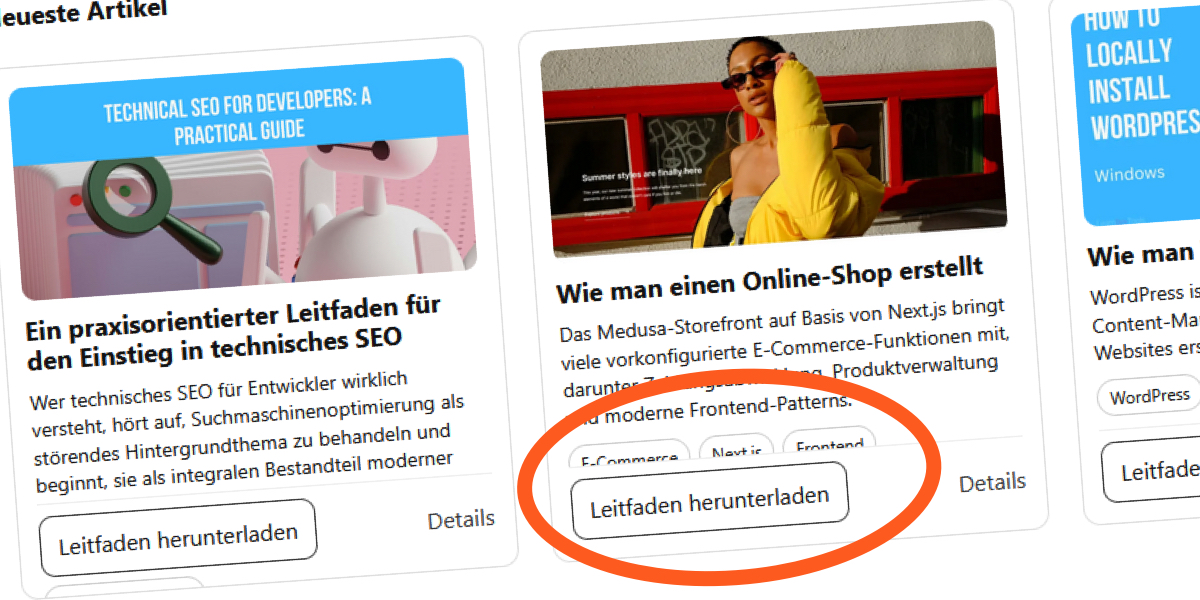
No. Using overflow: hidden only masks the symptom—it does not fix the underlying issue. Content still exceeds the card’s height, but it is cut off instead of overflowing visibly. This leaves users with incomplete information, especially problematic for accessibility. Moreover, when combined with -webkit-line-clamp, hidden overflow can produce unexpected clipping behavior across different browsers and font sizes. Removing the safety net reveals that the layout is fundamentally fragile. A proper solution requires rethinking the container’s sizing strategy, not just hiding the evidence.
4. What CSS techniques commonly cause fixed-height card failures?
Developers often use display: -webkit-box with -webkit-line-clamp to limit text lines inside a fixed-height card. While this creates a tidy mockup, it fails when the default font size increases or when translations produce longer text. The line-clamp value is fixed, but the actual line height and word lengths vary. Combined with a fixed container height, the clamped text may still overflow or be cut off prematurely. Additionally, setting explicit height on the card prevents the natural expansion that would accommodate longer content, leading to clipped text or layout shifts.

5. How does user font size adjustment affect fixed-height layouts?
Users with low vision or digital eye strain often increase their browser’s default font size. In a fixed-height card, this causes text to grow beyond the design’s intended dimensions. Since the container does not expand, content becomes cramped, overlapping, or hidden. The -webkit-line-clamp property may display fewer lines than intended because the increased font size reduces the number of characters that fit in the clamped area. This can make articles unreadable or force users to zoom, defeating the purpose of a clean grid.
6. What is a better alternative to fixed-height cards?
The most resilient approach is to avoid setting a fixed height on card components altogether. Instead, use min-height or let the card expand naturally with its content. This ensures layout integrity across languages, font sizes, and content changes. If you need visual alignment, consider using CSS Grid or Flexbox with align-items: stretch to make cards in a row share the same height dynamically, based on the tallest card. This method preserves vertical rhythm without imposing artificial limits. Testing with realistic content variations and accessibility settings is also crucial to catch overflow issues early.
Related Articles
- Criterion Collection Slashes Prices 30% Across Entire Catalog in Limited-Time Sale
- 6 Key Facts About the TanStack Supply Chain Attack That Hit OpenAI Devices
- Swift 6.3 Launches with Major C Interoperability and Cross-Platform Upgrades
- Samsung Galaxy A17 5G: Still a Viable Budget Phone, but the Competition is Closing In
- How to Navigate Windows 11 Insider Preview Builds: A Complete Step-by-Step Guide
- Mastering AI-Assisted Development: From Vibe Coding to Harness Engineering
- Introducing the Premier Tier: Elevating Provider Standards on the Terraform Registry
- BlackBerry's QNX Division Powers Safety in 275 Million Cars, Drives Half of Revenue – Yet Most People Have No Idea